Howdy, Stranger!
It looks like you're new here. If you want to get involved, click one of these buttons!
Categories
YL2 update August - Eyes & head stuff!
Back again with another update!
This will be slightly shorter update than you may have grown accustomed to. I was away on vacation earlier this month, and wanted to take it a bit easier than usual when I got back, working on more straight forward features. So not super heavy engine stuff this time in other words, but straight forward features are important too! So this will be more of a visual update.
Eyes
How exactly eyes are supposed to work in YL2 has been a huge question mark for us. We've had several ideas through out the months that we wanted to try out, but with all the stuff that has been going on, we felt like we never really had the time to truly investigate them. Now however, coming back from my vacation, this felt like an extraordinarily "lagom" task to start off with. So I jumped straight into it!
Originally I had intended to make the eye authoring as a sort of extension to our texture building system, using gradients and layers to procedurally generate the type of textures and effects desired. The benefit of such a system, naturally, would be that since the texture would be generated at runtime, the character size on disk could be kept very low. However, upon delving deeper into this method, I came to the conclusion that in order for such a system to encompass all the needs in terms of eyes, it would end up being too difficult to use. So I opted going for a more straight forward solution that would be both easier to use and implement.
With our eye authoring system, we have tried to strike a nice balance between detail, simplicity and customizability. We hope we offer enough features to accommodate most people!
So without further ado, let's see what it looks like!
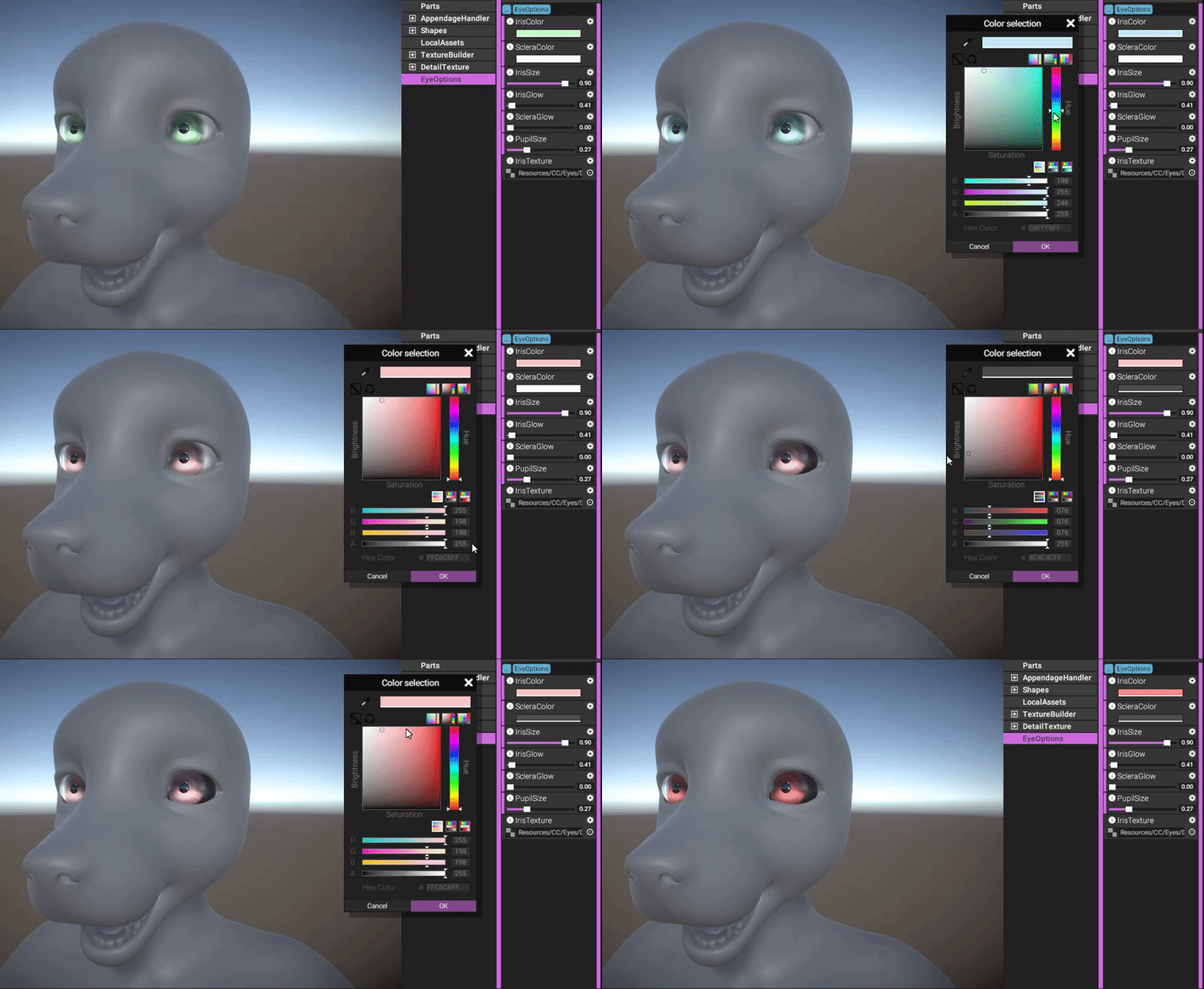
(Changing colors.)
https://gyazo.com/4e9b2156dc98a422841ba68bee2b04ce
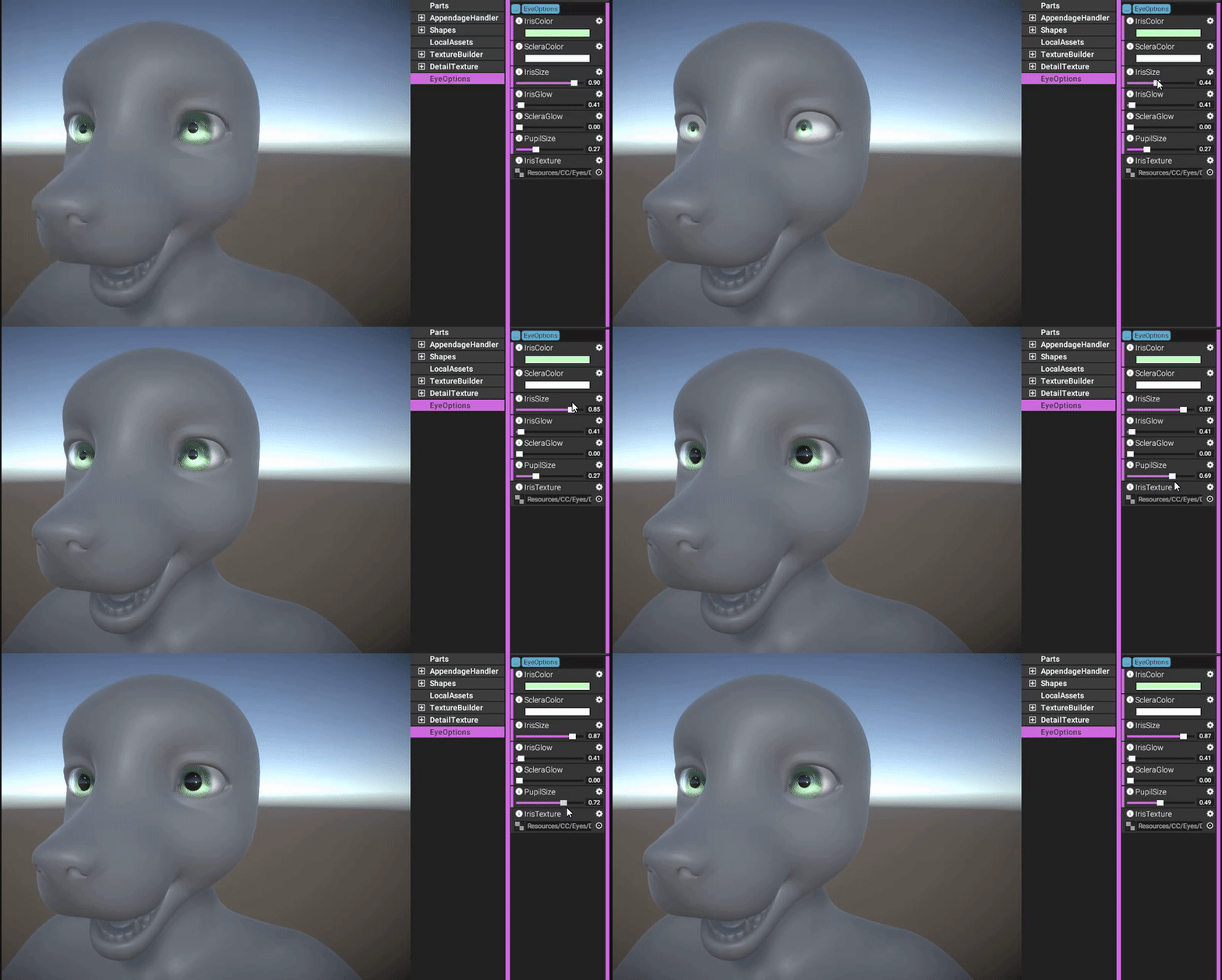
(Changing iris and pupil size.)
https://gyazo.com/8b8284db7e569c2b4855cd0dcd8f7048
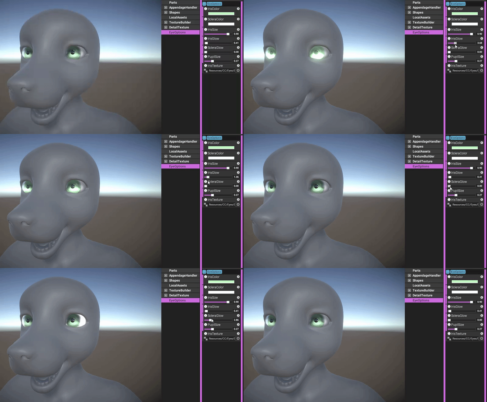
(Making iris and/or sclera glow.)
https://gyazo.com/bb9743dbca330b86d4aae6e313b1f507
We definitely want to make the size and glow settings accessible during interactions as well. I think it would be really cool to have the eyes react to climax and such!
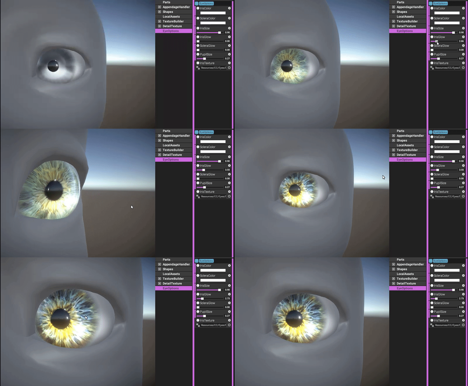
(Custom texture support.)
https://gyazo.com/c2d7eebf46993482a93e4bfaf16709af
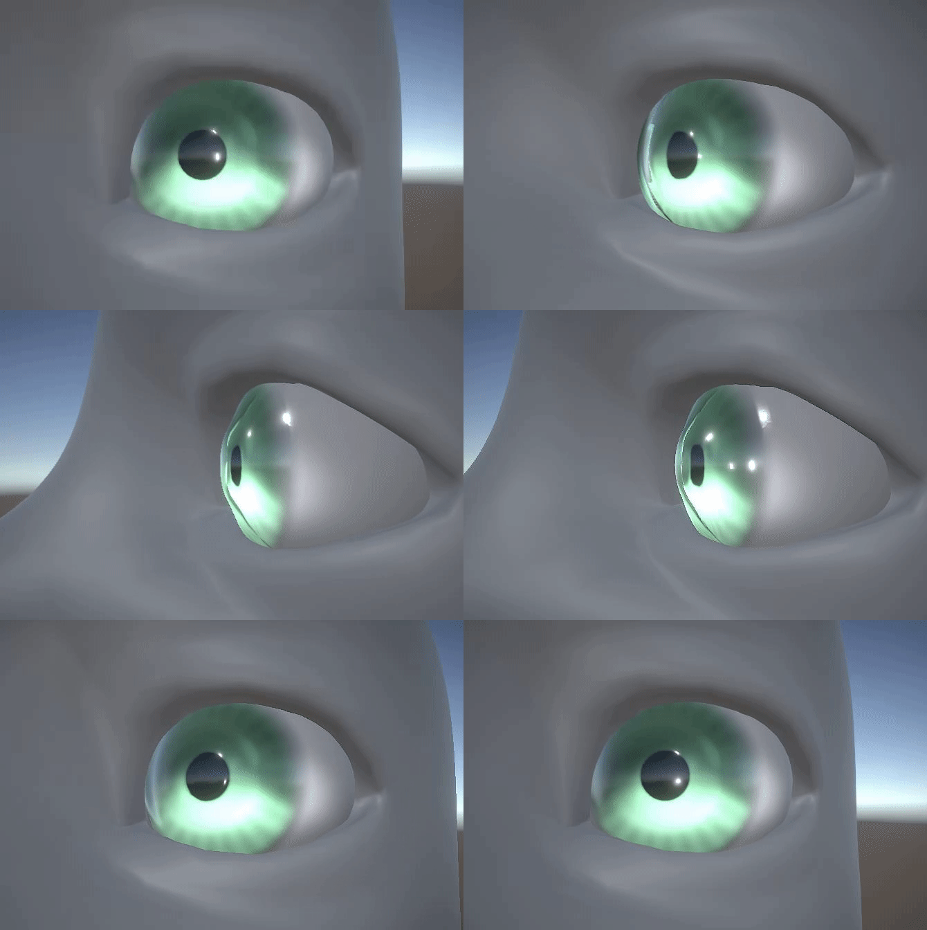
(Close look parallax effect.)
https://gyazo.com/6213dd6c6386d91a894f6691fa3798b4
Here's a guide showing all the steps involved in achieving the final look:
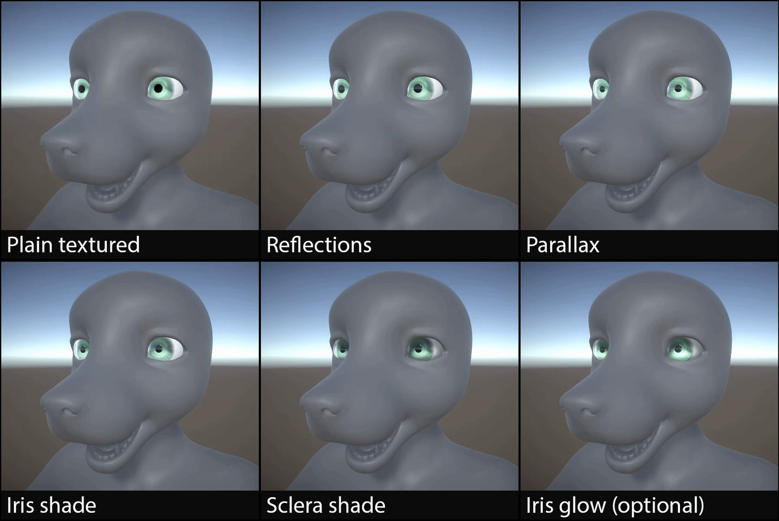
https://gyazo.com/f2d969e8768cd6300eb6ee11be8811e3
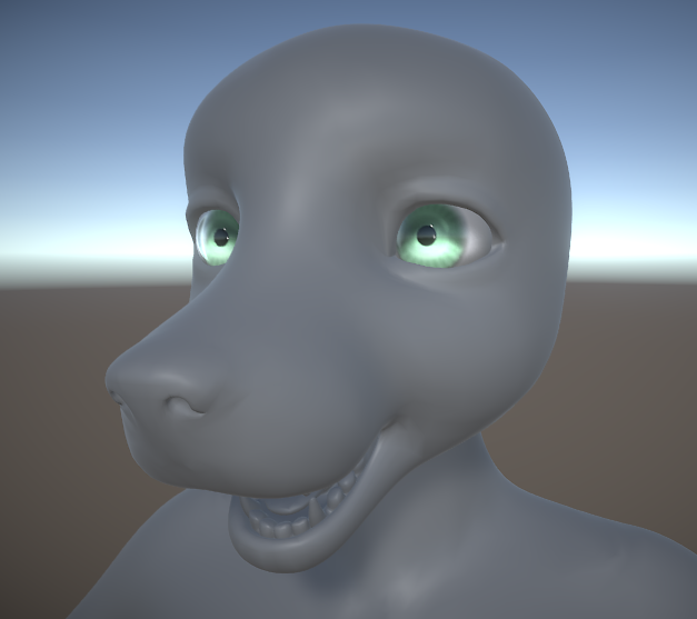
The final look:
Unlike some other eye systems that we have seen, that "bake" the sclera shading into the eye texture, we have a custom solution that keeps the sclera shading in place despite the eye moving around:
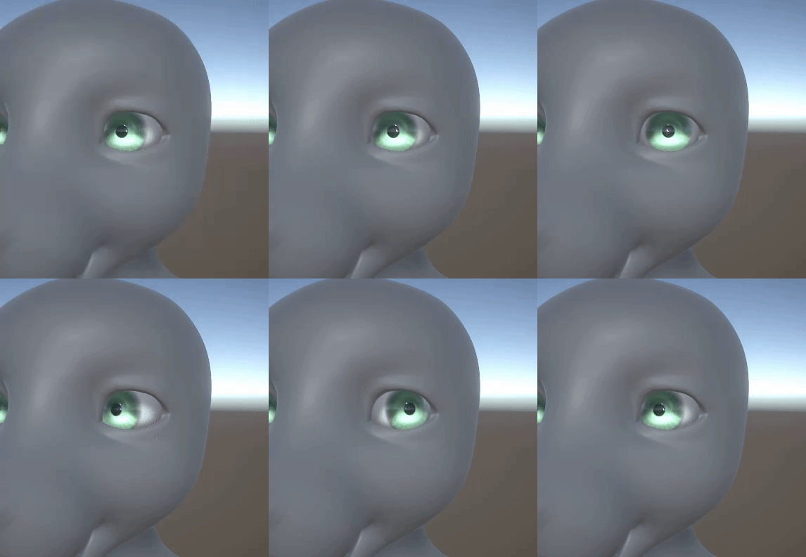
(Sclera shadow staying in place even as eye moves around.)
https://gyazo.com/ca756aeecea8fe6f05adf91b3bb84387
This is accomplished by rendering the eye a second time but with a special transparent material. This material renders on top of the first eye pass, causing it to darken, but with a Z offset (to make sure it actually renders on top). To prevent the offset eye from rendering through undesired places (for example, through the eye lids), we're using the stencil buffer to only render where eye pixels have already been rendered. (Since the first material is opaque, it renders into Z buffer and also uses Z tests, so if there are higher order eye lid pixels, the stencil will not be written there.)
Team mood
As you might remember from our previous update, "Nomistrav" recently joined our team and has been helping us by providing feedback on our designs. I know I already expressed this earlier, but let me just say this again that Nomistrav is making all the difference in the world to us. Before he was on board, it used to be just me doing all the feedback on dogson's work, and since I'm not a designer, I oftentimes had problems articulating my concerns in a way that was helpful. We would end up going back and forth, never really arriving at something that we were perfectly happy with, until we eventually lost interest or ran out of time and just moved on. Now, however, with Nomistrav's help we've been able to work far more efficiently and produce higher quality shapes, and are generally having so much more fun since it actually feels like we're making real progress. I think the mood in the team has been really great the past couple of weeks!
Also, recently we made some changes to how we communicate, that I think has resulted in a stronger feeling of solidarity between team members. It truly feels like we're all part of this special group, all doing our best in our own way to create something truly amazing for the furry fandom, all while having fun and discussing all sorts of creative topics. I'm super happy about it!
New head models
In connection to the section above... We were never really 100% happy with the head designs we did previously, so this month Dogson and Nomistrav have been collaborating to design new ones. Here are the results:
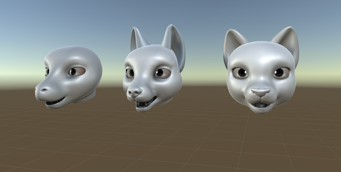
We've tried to make each head more pronounced and unique, so they really feel more lizardy, caniney and feliney, respectively. Also, we've tried to make them more cartoony/stylized, as you can see from the proportions. We're super happy how they turned out, and definitely think it was worth the remake.
Z Depth study
This is more of a side note, but I felt like bringing it up anyway because it has taken time from us.
Yiffalicious features a pivot placement system, where you press middle click to place the pivot at cursor location. The problem with this system is that it lacks precision. Even though you're clearly clicking something, a different location might be returned by this system. This is because it uses crude representations of the characters (and environment) when fetching the depth, since Unity is dependent on them in order to do raycasting:
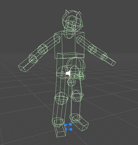
(Crude physical representation of a character in Yiffalicious.)
Some of you might remember that last year, we made a new system that would eliminate this problem. The method we used in that system was to render the scene a second time when middle-clicking, but with a replacement shader that instead of actually rendering shaded objects, would just output the distance from the camera to each rendered pixel. This method worked great from a precision sense, but with the huge drawback of having to render the scene twice. That is very costly to do, and I was never really happy with it. Especially not since I knew that Unity renders its own, internal depth texture, but that unfortunately is not possible to access through the APIs on the CPU. Furthermore, since this system's creation, we have started using more specialized materials when rendering our characters in YL2, meaning that this technique with shader replacement would not work anymore when fetching depth from characters.
However, now we have discovered a new method that allows us to do what we originally wanted to. Through some API and shader trickery, we have been able to fetch Unity's internal depth texture and read individual pixels from it on the CPU. In comparison to the previous method, this one is about 10 times faster (and most of that time is just overhead). It would be much, much faster if we were able to do GPU calls asynchronously (something that isn't possible in Unity 2017 but exists as an experimental feature in Unity 2018). (We're on Unity 2017 atm.)
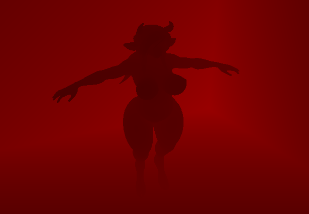
(Example of read Depth-buffer, darker values means closer.)
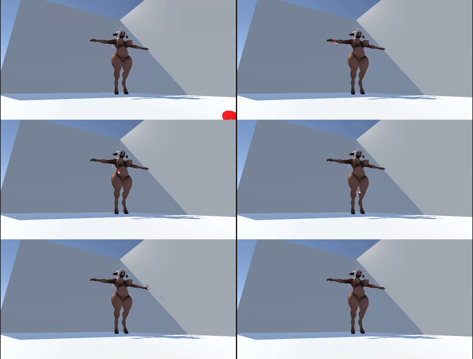
https://gyazo.com/55eeaeccad7b4b317b368c2bb3453ab1
(Placing orb at scene depth, without raycasting or any colliders. Pixel precision.)
This method offers the same pixel-precision as our other custom solution. However, to my surprise (and disappointment), while the pixel-precision is great, the depth precision is actually quite bad! When comparing the fetched Z value with a standard raycast, the Z value can be quite off, especially at longer distances. I was so happy when I discovered this method, only to be disappointed by its lacking depth precision. It seems no matter what we try, there are always trade-offs! Perhaps our final solution will be some kind of hybrid between them.
Summary
This month we've been working on eye customization and new head models, in addition to some other minor things.
I think the mood in the team is great. Ever since Nomistrav came along, we've been able to work more efficiently and are just having so much fun.
- odes
Comments
Why every furry media has to portray anthros in cartoonish ways?
Welp, as long as there are sliders to shrink the heads and eyes, narrow the muzzles and mouths in a way they don't look like they have progeria, I'm good...
Yo, chill. I think thats intentional. I guess you prefer something....realistic?
Im not sure where youre going with this....
P.S: After googling Progeria, now i cant unsee that head without comparing them to this...
You bastard x(
About being cartoonish...
I think thats just how the majority enjoys it?
Not that many were introduced into....ahem, this certain fandom by looking up actual animals having *redacted* and being hooked up by that. lol
Also, i think its also way easier to manage/design by actually having them like this instead of being realistic and such? And if youre worried about R2CK, i dont think you have to, the models differ by miles....lol
And i also have to say that your definition of clone,....might be flawed. This has nothing innit that screams R2CK. Not to mention YL came first before R2CK showed up (?)
If anything, its the exact opposite :P
Meanwhile, enjoy this :333
Sauce
Yeah, i'd take this cartoon style any day of the week instead of the real ones. lmao X)
P.S: Granted, i might not be able to replicate it THAT completely in YL2, but still...
I guess they're tackling the cartoony style first since that's considerably simpler than the careful balancing act between realism and stylization you have to pull to make, say, a horse's face appealing without compromising on the unique shapes and curves as the more cartoony style tends to do by emphasizing the cranium and cheeks in an effort to make the face more "human".
You'll note @Placebo00, that the cartoony look fits some species better than others. Cats, for example, already have a fairly short and small muzzle, so it's a relatively painless transition. A horse, on the other hand, looses a lot in translation if you try to do the same there, since their faces are practically nothing but muzzle. It isn't impossible to make an appealing cartoony version, of course, as the image bellow will attest, but I'll also provide a more realistic interpretation to compare and contrast it to.
Another thing I've been a bit concerned about with the modular system they're planning is necks. As you can see from the more realistic example above, it's often just as important as the actual face when it comes to emulating a given species' unique look. I hope the devs take this into account and offer the user the ability to choose a neck style in addition to head style. It will also be a useful feature for fixing up creative chimera creatures form various seemingly mismatched parts.
Now this might be harsh to say, but eh....You do you. Personally i got no problems with these cartoony-loony style lol. Granted, i have standards, but it looks like this is the amount that i can take. That, and im actually agreeing on the neck part. Not that imma make a hydra dude/dudette, but still....
I say prefrences, but then again, these cartoonish style might be a good start, before they start making things more "intricate"
Now, if only i havent googled Progeria......I still hate you, @nathan
Also, if i may...I say we shouldnt overcomplicate things right now. If i know people in U18 (or just people in general, lol), these mixed prefrences and ideas could start a sh*tstorm real quick.
Just let them focus finishing these basics first, and we'll worry the rest later.
I mean, i think they do make YL2 with customization as a focus, so whatever the case, we'll be seeing all the peoples tastes regardless, granted if the options were given and we can be creative enough to use dem tools provided.
TL;DR
Chill....Im sure we'll get it at one point. IF, things go as smooth as it should. Looking at you, devs.
I second that question
"2018" is what we've been saying lately. I feel that we have to get something out before the end of the year, regardless of what state the app is in. So it's really in our best interest to finish what we can and make it somewhat polished. We can always improve things as we go.
Uh... The 2018 release we're talking about _is_ the pre-alpha of the character creator.
I was only comparing Rack and YF2 on the character style sense (although my comedic rant may have cast a shadow upon my true intentions).
Let's say I prefer anthropomorphic animals that looks like they can actually live on our own universe...
...instead of something that jumped straight out of Space Jam.
The more YL2 sways towards the later, the more I will oppose it.
Dogson (chief modeller after YL) made it...
Let that sink in...
You gotta remember that these are very basic models, untextured and unfinished. They're more for testing on their end and to have something to show us.
Not really worth the devs' time at this point as detailed characters would need to be implemented after the rigging and scaling is finished for the CC.
I imagine they are sticking with a similar style to YL1 as that's the style Dogson is more farmiliar with? But don't quote me on that .
Also, as I said before, I think YL1 is great as it's right now, and I prefer that all the work is done to YL2.