Howdy, Stranger!
It looks like you're new here. If you want to get involved, click one of these buttons!
Categories
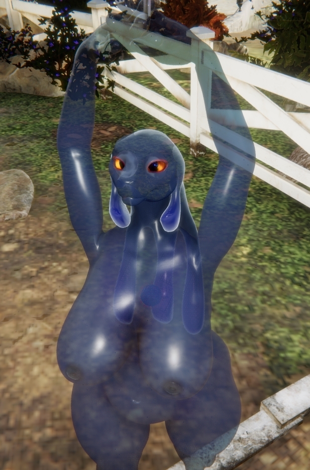
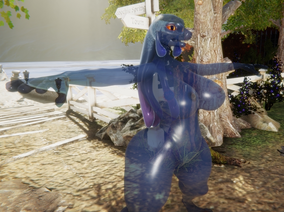
Selene: Slime Girl
A lot of playing around with alphas and a lot of learning went into her. I'd appreciate any constructive criticism to improve her quality. She's in the cloud too, of course.


Comments
Could use some variability in the transparency, as currently she looks more like a spirit than a physical creature due to the perfect uniformity. Don't know if it's possible (never having gotten around to testing this functionality), but it would work best if you lessened the alpha in areas where there's more thickness, namely the torso, hips/buttocks and breasts. Leave the thinner parts of limbs more transparent. I've tried looking for an image to better illustrate what I mean, but this is the best I came up with:
Notice how the neck is almost completely transparent compared to the rest? The pinched waist also has a similar effect, though to a much lesser extent. Basically, the more mass, the less see-through.
Also, might be a good idea to put some texture emission on her core organ. Didn't even notice it at first glance.
Could you explain the process of how you did this character, by the way? I've got an idea for a sauna spirit composed of water vapor that'd benefit from knowing about the way transparency for character bodies works.
I'll have to play around with the texture emission on the core organ more to make it more noticeable. The problem is that the alpha layers on the surface obscure the interior objects. But you gave me an idea of how to approach that problem, which I didn't have before.
As to how I created her, some elements were easier to accomplish than others. I created a medium gray texture as a base, which was a uniform gray. I'm going to play around with changing the values in the mask to see how much it impacts the transparencies, but for ease of use and learning, a constant value in the mask proved invaluable. I used this mask with an alpha to create the transparency effect and found using replace and exclusion blend modes to have the best effect. There are certain levels of alpha and opacity which I found to just not look good, creating a grainy effect, which I think is something Odes mentioned in one of his videos, but if calibrated correctly, it's possible to avoid that.
Too late I realized that the hair has a materials option pbr_transparent or sss_transparent that would have made my work a lot easier, but it is not available (at this time at least) for the body itself. Even then, alphas can make this much more pronounced. I'm going to incorporate this in the next iteration.
Color matching becomes a bit more challenging when working with alphas because they can alter a lot of the effects, and I wish I had a better method than trial and error in resolving it.
Superimposition plays a noticeable role when working with transparencies. An object that is more opaque superimposed over an object that is less opaque will obscure it, by degrees. This can create unwanted visual artifacts or strange lines, so I tried to avoid doing it when possible. Creating an alpha to hide the object beneath it usually fixes this problem. Even objects that don't create artifacts still play into the composition. The more transparent surfaces you have superimposed, the more opaque it becomes.
The eyes are physical objects and are very plainly visible inside of the skull when the skull is transparent, so my solution was to create two garment objects that fit around the eyeballs and arranged them in blender to fit exactly around them. I'm by no means an expert at clothing or meshing on the whole, but this step was fairly easy even for me. I colored them to be as unobtrusive as possible, but they are visible if you look. I attempted to make a double-sided alpha that would obscure them entirely, but nothing I tried seemed to work, so this is my best solution. If anyone has a better fix, I'd love to hear it!
Going through this has given me some insights into how I can improve Selene myself, and looking at the model again with new eyes revealed some errors, so I thank you for that. I'm sure there are technical tricks I could use to improve this further, such as thickness maybe, but that's for future versions. I hope this helps!
I know it isn't entirely accurate to physics, but it's the best solution within current limitations. Thinking about implementing a shader similar to the example you gave? Would be a nice addition to the arsenal, to be sure, but not a priority. If it turns out to be more complicated to do than it initially seems, would probably be best to put it on the backburner while more important things get worked on.
@Diplocaulus
Glad to be of service. One trick I thought of doing, to get around the lack of garment material options for the base mesh, is to export the base mesh (maybe using the new offset model export function so there's no seams between body parts) and re-import it as a "garment," then just make the base mesh completely transparent. It probably goes way over the triangle limit, though, if it's done like that. Hey @odes, any chance of getting some relief on this? Maybe an option to somehow disable rendering on the base mesh so it doesn't count towards the triangle total, if implementing the garment material options for the base mesh itself isn't a quick and easy thing to do?